
Text Editor
I really
The Text Editor toolbar provides various formatting and content editing tools that allow you to create and customize content with ease. Here is a detailed breakdown of what each button does:
1. Header Styles (H1, H2, H3, H4)
- Use these buttons to format selected text as different levels of headings.
- H1: Main heading (largest).
- H2: Subheading.
- H3: Sub-subheading.
- H4: Smaller subheading.

2. Paragraph (P)
- Converts the selected text into a regular paragraph. This is useful if you've applied a heading or other format that you want to revert back to standard paragraph formatting.
3. Unordered List (UL)
- Creates a bullet-point list from the selected text. Headers and paragraphs can contain Unordered Lists.
4. Ordered List (OL)
- Creates a numbered list from the selected text. Headers and paragraphs can contain Ordered Lists.

5. Bold (B)
- Makes the selected text bold to emphasize it.

6. Italic (I)
- Makes the selected text italicized for emphasis or distinction.

7. Small
- Makes the selected text small.

8. Underline (U)
- Underlines the selected text.

9. Add Class (Cls+)
- Adds a custom CSS class to the selected HTML element. This is useful for applying specific styling or custom formatting via CSS.
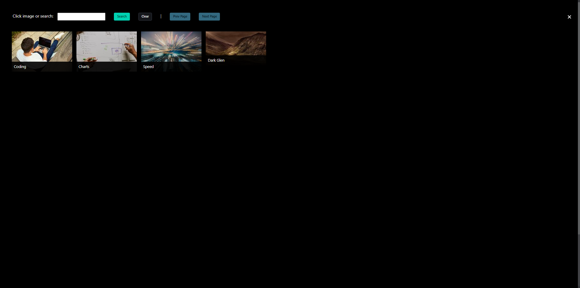
10. Image
- Select an image from uploaded images.
- To add a new image, see (Uploading an Image)
11. Undo (↶)
- Reverts the last change you made.
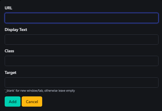
12. Hyperlink (🔗)
When you click the Link (🔗) button in the toolbar, a dialog box will open with several options for configuring the hyperlink. Here’s an explanation of each option:
-
URL
- This is the address of the webpage you want to link to.
- Enter the full URL (including
http://orhttps://) of the destination page. - Example:
https://www.example.com
-
Display Text
- This is the text that will be visible to users, which they can click on to follow the link.
- If left blank, the URL itself will be displayed as the clickable text.
- Example: Enter "Click Here" if you want this text to appear instead of the full URL.
-
Class
- This field allows you to apply a CSS class to the hyperlink for custom styling.
- If your site has specific CSS classes for styling links, you can add the class name here to apply those styles.
- Example: Enter
button-linkto style the link as a button if your CSS has such a class.
-
Target
- This defines where the link will open when clicked.
- Leave blank to open the link in the same tab/window.
- Enter
_blankto open the link in a new tab or window.
- This is useful if you want to keep users on your site while directing them to external resources.
- This defines where the link will open when clicked.
-
Add: Click this button to insert the link with the provided configurations into your content.
-
Cancel: Click this button to discard the link and close the dialog without making any changes.
13. Unlink Hyperlink(🔗 with X)
- To remove a hyperlink, simply select the linked text and click the Unlink button (🔗 with an X) in the toolbar.
14. Anchor (⛓)
- Inserts an anchor at the cursor position, which can be used to create internal links that jump to specific parts of a page.